
The Brains and Machines Lab

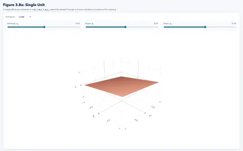
This is an informal 3D version of an Understanding Deep Learning (UDL) interactive figure 3.8a, demonstrating how the output of a single neuron changes as a function of its parameters, inputs, and nonlinearity. In class, use the figure to connect the equation for a neuron with the geometry of a plane and then switch activations to show how nonlinearities reshape the output.
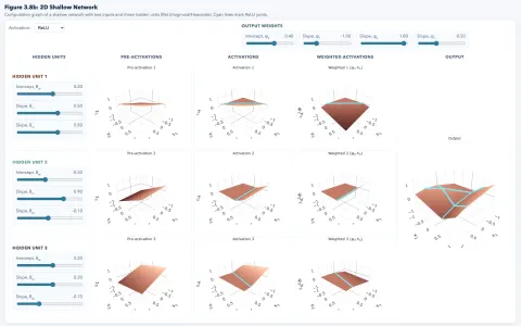
This is an informal 3D version of UDL interactive figure 3.8b, showing how several hidden units contribute pre-activations, activations, weighted activations, and a final output surface. Use it immediately after the single-unit figure so students see how simple pieces combine into a richer function.
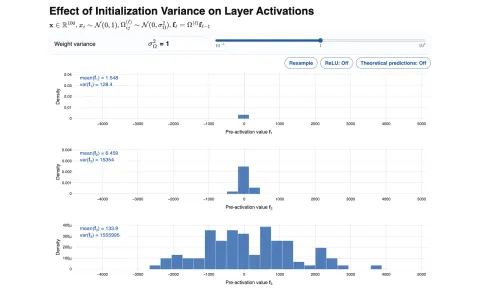
This demo shows activation distributions across layers as the weight variance changes. Use it to make vanishing and exploding activations visible before introducing initialization heuristics: compare tiny, moderate, and huge variance settings, then turn theoretical predictions on to connect the pictures back to the math (uses UDL mathematical notation).
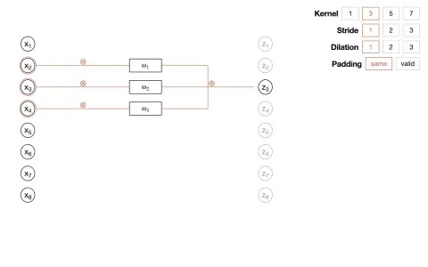
This demo is a standalone explanation of receptive fields in one-dimensional convolution. Use it to make kernel size, stride, dilation, and padding concrete: change exactly one setting at a time and have students identify which input samples each output unit can access (uses UDL mathematical notation).
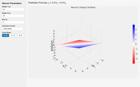
This demo is similar to "Single neuron function surface" above, but uses standard machine learning conventions. Use it to discuss how w₁, w₂, and bias shape a prediction score, how activation choice changes the interpretation, and how a smooth surface becomes a hard decision rule.
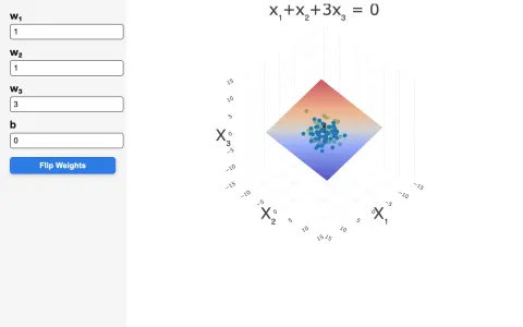
This demo shows the classifier equation as a plane in three-dimensional input space. It is a good bridge from 2D line drawings to higher-dimensional linear models: vary the weights and bias to show how the plane's orientation and offset determine the positive and negative sides.
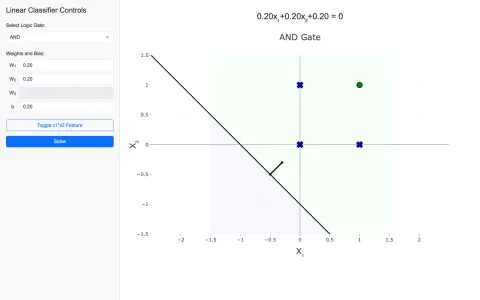
This demo uses AND, OR, and XOR to expose the limits of linear separability. Use AND or OR first so students experience a successful linear solution, then switch to XOR and let the failure motivate feature expansion through the x₁·x₂ interaction.
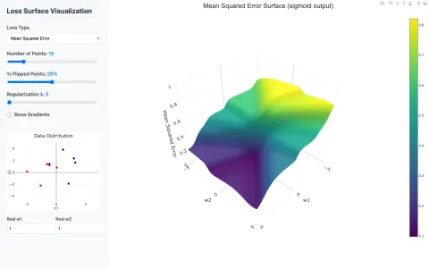
This demo connects classifier parameters to the surface optimized during learning. It is strongest after the geometric demos: compare MSE, 0-1 loss, and cross-entropy, then add flipped labels or regularization to show why some objectives are easier or harder to optimize.
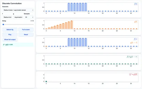
This demo decomposes convolution into a shifted kernel, overlap, pointwise product, and output value. Use it slowly: scrub through the delay parameter and ask students to explain why each output sample rises or falls as the signal and kernel overlap.
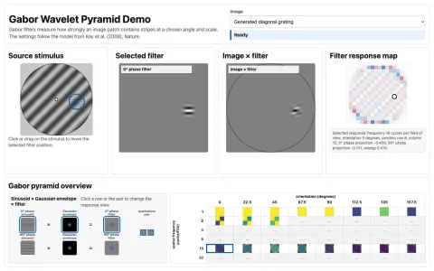
This demo shows how Gabor filters measure orientation, spatial frequency, phase, and position-dependent structure in an image. Use it after convolution: move the filter across the stimulus, compare the 0-degree and 90-degree phase responses, then switch to quadrature energy and the pyramid overview to connect local receptive fields with orientation- and scale-selective visual representations.
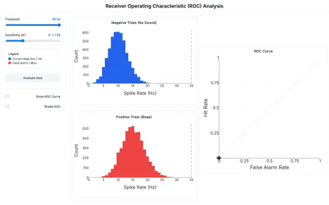
This demo ties signal-detection distributions to the ROC curve. Use the threshold slider to separate criterion effects from sensitivity effects: moving the threshold trades hit rate against false alarms, while changing d' alters how separable the underlying positive and negative cases are.
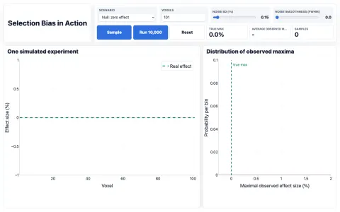
This demo simulates noisy voxel-wise experiments and tracks the maximum observed effect across repeated samples. It is a direct way to teach selection bias and winner's curse: begin with the null scenario, run many samples, and show that selecting the maximum creates a convincing-looking effect from noise.